Theming
Make the community look like your app: its colors, fonts, logo, light or dark mode and the title bar of the main feed. To replace the SDK icons, see Icons and images.
Before you begin
- Complete the Quickstart: the SDK is initialized and the community screen opens in your app.
- Collect your brand values: a primary color with a lighter and a darker variation, the color of text shown over the primary color, and your fonts and logo as app resources.
How it works
The theme is a set of optional values. A value you do not set keeps the SDK default, so you only override what differs from your brand. Pass colors without transparency.
| Platform | Where the theme is set |
|---|---|
| Android | The OctopusTheme composable that wraps the Octopus screens, usually in the container of octopusComposables. |
| iOS | The \.octopusTheme environment value on OctopusHomeScreen. |
| Flutter | The theme parameter of OctopusHomeScreen or showOctopusHomeScreen(). |
| React Native | The theme object passed to initialize(). |
| Unity | The Octopus SDK > Theme Configuration window of the Editor, or OctopusSDK.SetTheme(...) at runtime. |
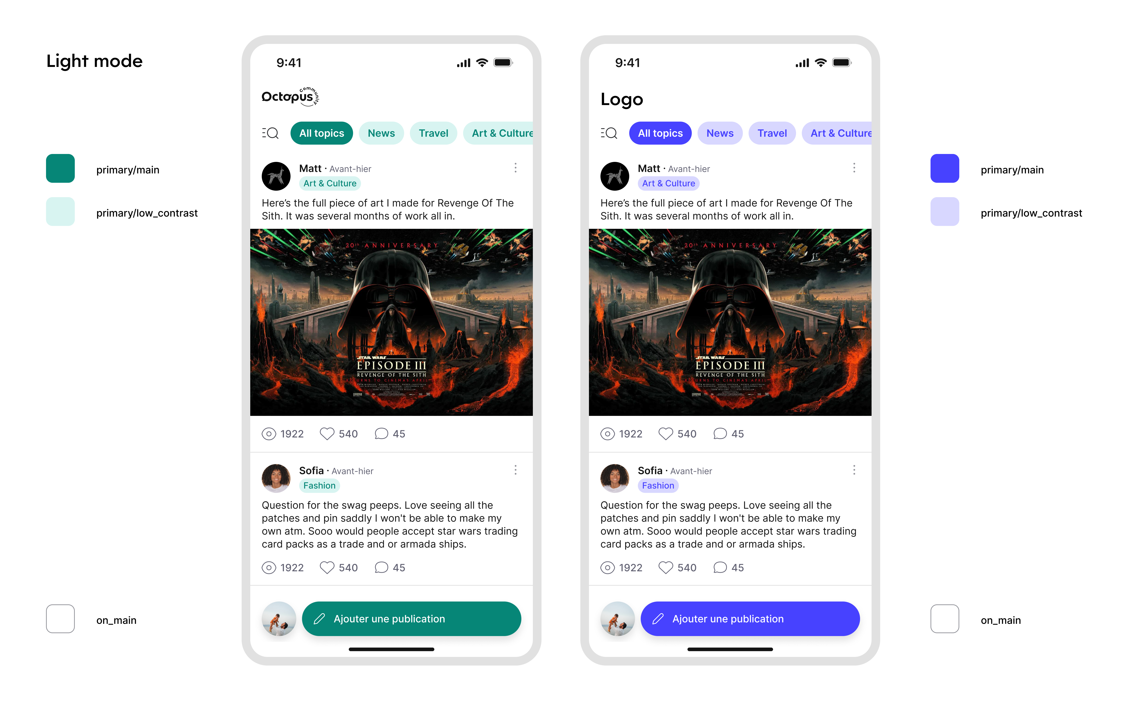
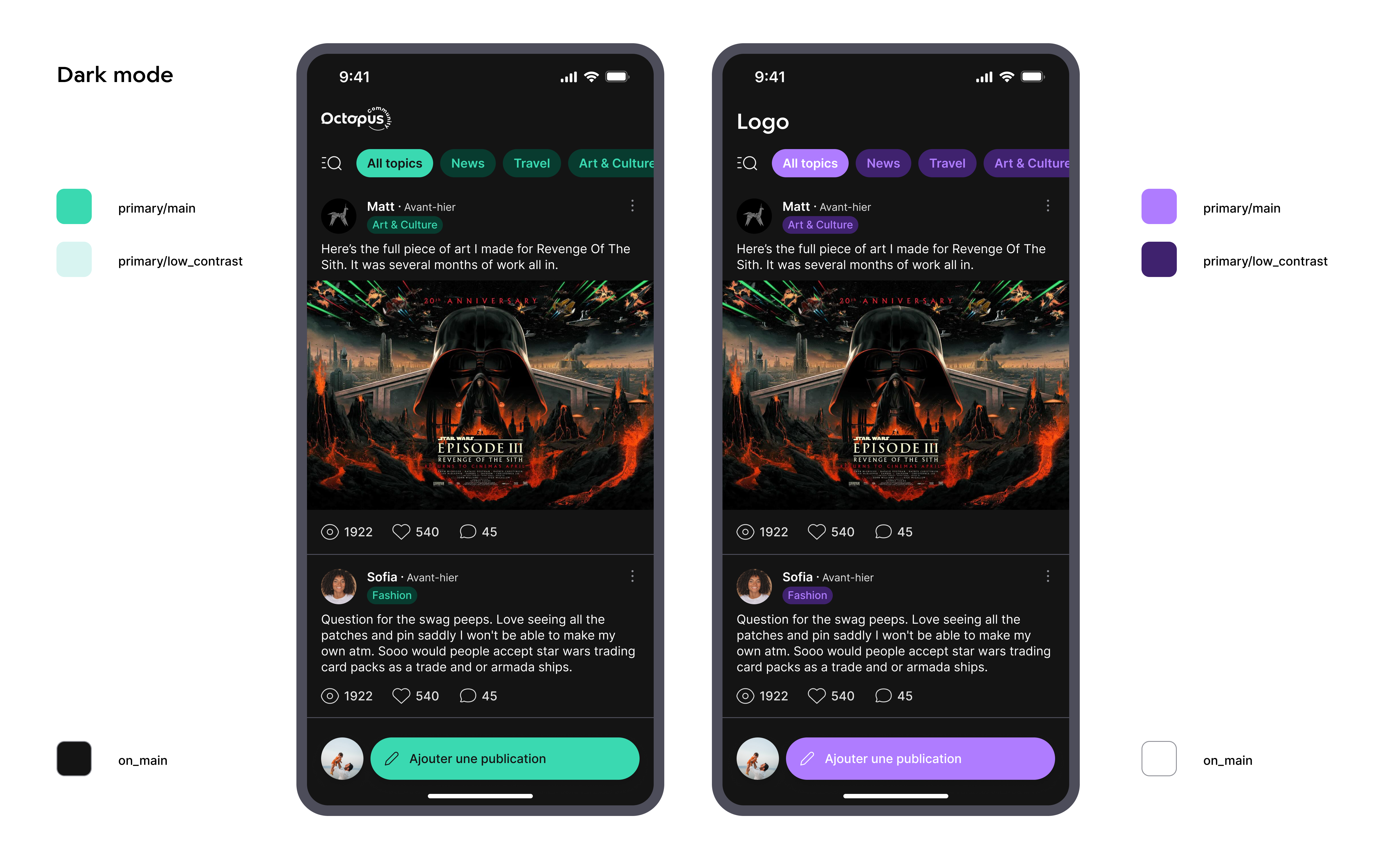
The screens below show where each color is used, in light and dark mode:
1. Set the colors
The color scheme has four main values: the primary color, its low-contrast and high-contrast variations, and the color of content shown over the primary color.
- Android
- iOS
- Flutter
- React Native
- Unity
When no colorScheme is given, the SDK derives its palette from your app's MaterialTheme.colorScheme. To set the colors yourself, start from octopusLightColorScheme() or octopusDarkColorScheme() and override the values you need. Their defaults are the Octopus palette: a 0xFF141414 primary in light mode, a white primary in dark mode.
octopusComposables(
    navController = navController,
    container = { _, content ->
        OctopusTheme(
            colorScheme = if (isSystemInDarkTheme()) {
                octopusDarkColorScheme(
                    primary = yourDarkPrimaryColor,
                    primaryLow = yourDarkLowContrastColor,
                    primaryHigh = yourDarkHighContrastColor,
                    onPrimary = yourDarkOnPrimaryColor,
                )
            } else {
                octopusLightColorScheme(
                    primary = yourLightPrimaryColor,
                    primaryLow = yourLightLowContrastColor,
                    primaryHigh = yourLightHighContrastColor,
                    onPrimary = yourLightOnPrimaryColor,
                )
            },
            content = content,
        )
    },
)
The OctopusThemeConfigurator shows a live preview of the Octopus screens while you pick your colors.
OctopusHomeScreen(octopus: octopus)
    .environment(
        \.octopusTheme,
        OctopusTheme(
            colors: .init(
                primarySet: OctopusTheme.Colors.ColorSet(
                    main: yourPrimaryColor,
                    lowContrast: yourLowContrastColor,
                    highContrast: yourHighContrastColor
                ),
                onPrimary: yourOnPrimaryColor
            )
        )
    )
OctopusHomeScreen(
  theme: OctopusTheme(
    primaryMain: const Color(0xFF6200EE),
    primaryLowContrast: const Color(0xFFBB86FC),
    primaryHighContrast: const Color(0xFF3700B3),
    onPrimary: Colors.white,
  ),
)
Colors are hex strings (#FF6B35 or FF6B35). A value that cannot be parsed is dropped with a warning, and the SDK default applies.
import { initialize } from '@octopus-community/react-native';

await initialize({
  apiKey: 'YOUR_API_KEY',
  connectionMode: { type: 'sso', appManagedFields: [] },
  theme: {
    colors: {
      primary: '#FF6B35',
      primaryLowContrast: '#FFB899',
      primaryHighContrast: '#CC4400',
      onPrimary: '#FFFFFF',
    },
  },
});
In the Editor, open Octopus SDK > Theme Configuration and select the Colors tab. The colors are applied at initialization. At runtime, pass an OctopusColorScheme to OctopusSDK.SetTheme(...). Color.clear means "not set" for every color and keeps the native default.
OctopusSDK.SetTheme(
    colorScheme: new OctopusColorScheme(
        primary:     new Color32(255, 0, 0, 255),
        primaryLow:  new Color32(255, 179, 179, 255),
        primaryHigh: new Color32(204, 0, 0, 255),
        onPrimary:   new Color32(255, 255, 255, 255)
    )
);
Background and link colors
Android availableiOS ≥ 1.13.0Flutter ≥ 1.13.1React Native ≥ 1.13.0Unity ≥ 1.12.8
Two more optional colors: background colors every community screen, and link colors the URLs shown in posts and comments. An unset value keeps the SDK default.
- Android
- iOS
- Flutter
- React Native
- Unity
The default link color is 0xFF1D9BD1 in both schemes. The default background is white in light mode and 0xFF141414 in dark mode.
octopusLightColorScheme(
    background = yourBackgroundColor,
    link = yourLinkColor,
)
OctopusTheme(
    colors: .init(
        primarySet: yourPrimarySet,
        onPrimary: yourOnPrimaryColor,
        link: yourLinkColor,
        background: yourBackgroundColor
    )
)
OctopusTheme(
  background: const Color(0xFFF7F7FB),
  link: const Color(0xFF0B6BCB),
)
On Android, a background also selects the base palette. Every color you do not set is derived from the light or dark palette that matches the luminance of that background, so a light background on a device in dark mode gets the light palette.
theme: {
  colors: {
    primary: '#FF6B35',
    background: '#F7F7FB',
    link: '#0B6BCB',
  },
},
In the Editor, the Colors tab lists Link and Background under Optional, each behind its own checkbox. At runtime, use the six-argument constructor.
new OctopusColorScheme(
    primary:     new Color32(255, 0, 0, 255),
    primaryLow:  new Color32(255, 179, 179, 255),
    primaryHigh: new Color32(204, 0, 0, 255),
    onPrimary:   new Color32(255, 255, 255, 255),
    link:        new Color32(0, 102, 204, 255),
    background:  new Color32(250, 250, 250, 255)
)
2. Set the fonts
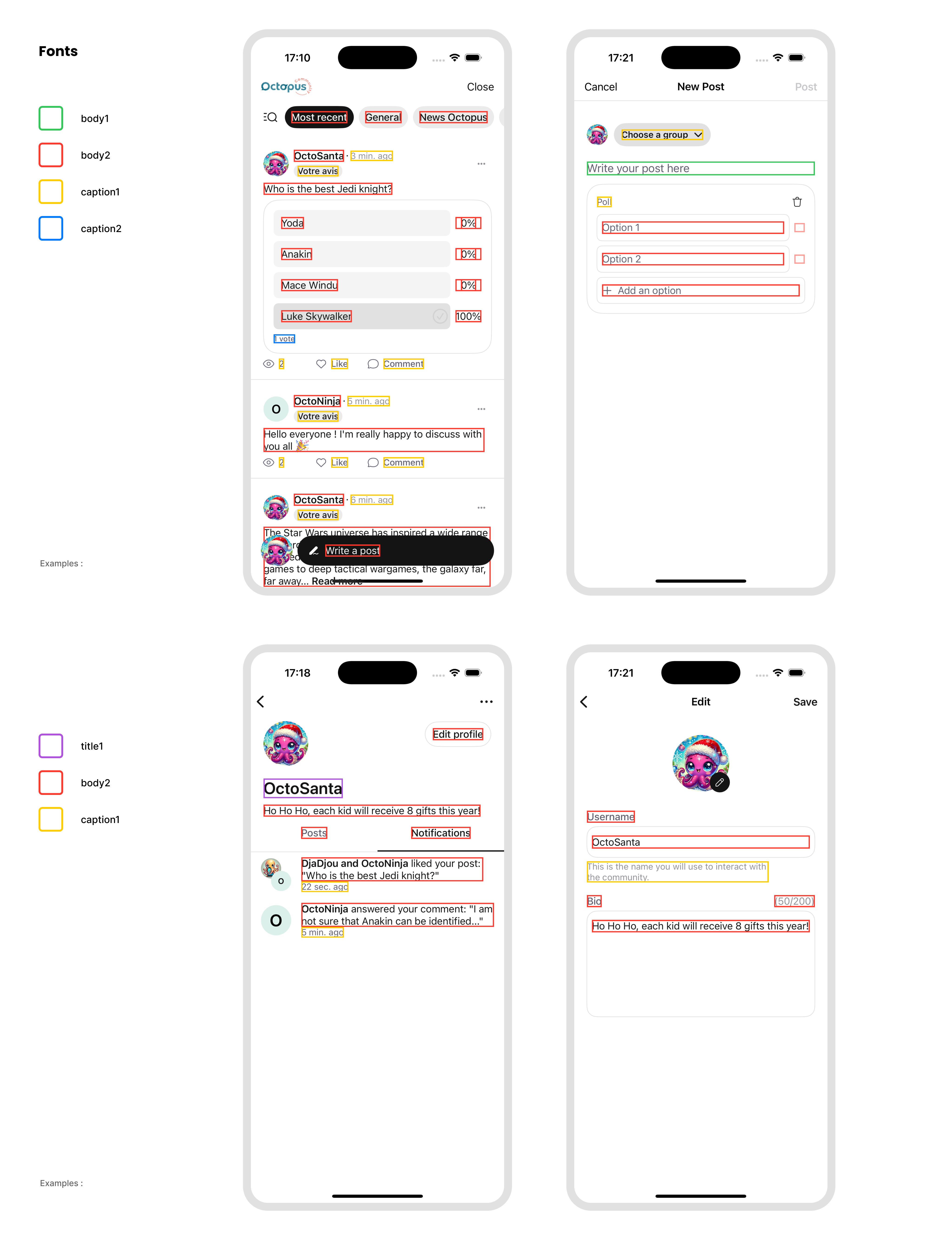
The SDK uses six text styles: title1, title2, body1, body2, caption1 and caption2. Their default sizes are 26, 22, 18, 16, 14 and 12. The picture below shows where each style is used:
- Android
- iOS
- Flutter
- React Native
- Unity
Each style is a Compose TextStyle. The default title1 also sets a 36 sp line height.
OctopusTheme(
    typography = OctopusTypographyDefaults.typography(
        title1 = TextStyle(fontSize = 24.sp, lineHeight = 32.sp),
        body1 = TextStyle(fontSize = 17.sp),
    ),
    content = content,
)
Each style is a SwiftUI Font.
OctopusTheme(
    fonts: .init(
        title1: Font.custom("Courier New", size: 26),
        body1: Font.custom("Courier New", size: 17)
    )
)
Each style takes a font size. An explicit size is a base size: it still scales with the reader's text-size setting.
OctopusTheme(
  fontSizeTitle1: 24,
  fontSizeBody1: 17,
)
Each style takes a size and an optional fontType: 'serif', 'monospace' or 'default'.
theme: {
  fonts: {
    textStyles: {
      title1: { fontType: 'serif', fontSize: { size: 24 } },
      body1: { fontSize: { size: 17 } },
    },
  },
},
In the Editor, use the Fonts tab. At runtime, pass an OctopusFonts to SetTheme or OctopusSDK.SetFonts(...). Each OctopusFont names the native font on each OS, then gives the size.
OctopusSDK.SetFonts(new OctopusFonts(
    title1: new OctopusFont("onest_regular", "Onest-Regular", 24),
    body1:  new OctopusFont("onest_regular", "Onest-Regular", 17)
));
Font family and weight
Android availableiOS availableFlutter ≥ 1.13.1React Native ≥ 1.13.0Unity available
Use your own font family and weight for every SDK text. The SDK renders its screens natively, so the font must exist as a native resource of your app: a font resource under res/font/ on Android, and a font declared under UIAppFonts in Info.plist on iOS, referenced by its PostScript name. A name that does not resolve is logged as a warning, and the SDK keeps its default font.
- Android
- iOS
- Flutter
- React Native
- Unity
Set fontFamily and fontWeight on each TextStyle.
val brand = FontFamily(Font(R.font.inter_semibold, FontWeight.SemiBold))

OctopusTypographyDefaults.typography(
    title1 = TextStyle(fontFamily = brand, fontWeight = FontWeight.SemiBold, fontSize = 26.sp),
    body1 = TextStyle(fontFamily = brand, fontSize = 18.sp),
)
OctopusTheme(
    fonts: .init(
        title1: Font.custom("Inter-SemiBold", size: 26).weight(.semibold),
        body1: Font.custom("Inter-Regular", size: 18)
    )
)
fontFamily and fontWeight apply to every text style and to the title of the navigation bar. fontWeight is an int from 100 to 900 and needs no native setup. A value out of range fails an assert, so it is caught in debug builds only.
Declaring the font in pubspec.yaml is not enough: register it natively under the same name, in android/app/src/main/res/font/ and in ios/Runner/Info.plist.
OctopusTheme(
  fontFamily: 'Inter',
  fontWeight: 600,
)
In an Android app, setting a font family or weight also sets the navigation-bar title to the body1 size, which is smaller than its default. Use the body1 size to control it.
A font linked with react-native-asset is registered with your app, which is what the SDK needs. On Android, pass the resource name (res/font/my_brand_font.ttf becomes 'my_brand_font'). On iOS, pass the PostScript name.
A resolved fontFamily wins over fontType on every style. fontWeight is a whole number from 100 to 900; any other value is dropped with a warning.
theme: {
  fonts: {
    fontFamily: 'my_brand_font',
    fontWeight: 600,
  },
},
In an Android app, setting a font family or weight also sets the navigation-bar title to the body1 size, which is smaller than its default. Use the body1 size to control it.
OctopusFont takes the Android font resource name and the iOS font name. Its optional fontWeight ≥ 1.13.0 goes from 100 to 900; a value out of range throws ArgumentOutOfRangeException. Empty names and a size of zero keep the native font and change only its weight.
OctopusSDK.SetFonts(new OctopusFonts(
    title1: new OctopusFont("onest_regular", "Onest-Regular", 24, fontWeight: 600),
    body1:  new OctopusFont("", "", 0, fontWeight: 500)
));
Navigation-bar item size
Android not availableiOS availableFlutter ≥ 1.13.1React Native ≥ 1.13.0Unity available
The theme can set a dedicated font for the navigation-bar items. When it is not set, navigation-bar items follow body1.
- Android
- iOS
- Flutter
- React Native
- Unity
Navigation-bar item size is not yet available on Android.
OctopusTheme(
    fonts: .init(navBarItem: Font.custom("Courier New", size: 17))
)
The value applies to iOS apps only: Android has no navigation-bar item style.
The size also applies to showOctopusCreatePostScreen.
OctopusTheme(fontSizeNavBarItem: 17)
The value applies to iOS apps only: Android has no navigation-bar item style.
Once textStyles holds any entry, every style is sent to iOS explicitly. An unset navBarItem then falls back to body1, or to a 17 pt system font when body1 is unset too.
theme: {
  fonts: {
    textStyles: {
      navBarItem: { fontSize: { size: 17 } },
    },
  },
},
The value applies to iOS apps only: Android has no navigation-bar item style.
OctopusSDK.SetFonts(new OctopusFonts(
    navBarItem: new OctopusFont("onest_regular", "Onest-Regular", 17, fontWeight: 500)
));
3. Set the logo
The logo is shown on the main feed and on the profile creation screen. Without one, the SDK keeps its default. To replace the SDK icons, see Icons and images.
- Android
- iOS
- Flutter
- React Native
- Unity
logo takes a composable lambda that returns a Painter.
OctopusTheme(
    images = OctopusImagesDefaults.images(
        logo = { painterResource(R.drawable.your_logo) },
    ),
    content = content,
)
OctopusTheme(
    assets: .init(logo: UIImage(named: "YourLogo"))
)
OctopusTheme(
  logoBase64: yourBase64EncodedLogo,
)
import { Image } from 'react-native';

theme: {
  logo: {
    image: Image.resolveAssetSource(require('./assets/logo.png')),
  },
},
In the Editor, set the logo in the Top Bar tab. At runtime, OctopusLogo names the native resource on each OS.
OctopusSDK.SetLogo(new OctopusLogo(
    androidDrawableName: "my_logo",
    iOSResourceName: "Data/Raw/my_logo.png"
));
Logos and fonts are not Unity assets. The Editor window imports them as native Android and iOS resources at build time. With the runtime API only, add the Android drawables, font resources and iOS bundle resources to your build yourself.
4. Choose light or dark mode
By default, the community follows the appearance of the device. You can give separate colors for light and dark mode, or force one mode for the community only.
- Android
- iOS
- Flutter
- React Native
- Unity
The theme is a composable, so pick the scheme with isSystemInDarkTheme() or with your own app setting, as in Set the colors.
OctopusTheme(
    colorScheme = if (useDarkCommunity) octopusDarkColorScheme() else octopusLightColorScheme(),
    content = content,
)
Give your colors as dynamic Color values (for example from an asset catalog with light and dark variants). If your app supports only one mode, add UIUserInterfaceStyle to your Info.plist with the value Light or Dark.
<key>UIUserInterfaceStyle</key>
<string>Light</string>
themeMode forces a mode. Leave it unset to follow the system.
OctopusTheme(
  primaryMain: const Color(0xFF6200EE),
  themeMode: OctopusThemeMode.dark,
)
Pass separate light and dark color sets. setThemeMode ≥ 1.13.0 forces 'light' or 'dark' for the Octopus UI only, and 'system' follows the device again. You can call it before initialize(). An open community screen recolors in place.
import { initialize, setThemeMode } from '@octopus-community/react-native';

await initialize({
  apiKey: 'YOUR_API_KEY',
  connectionMode: { type: 'sso', appManagedFields: [] },
  theme: {
    colors: {
      light: { primary: '#FF6B35', onPrimary: '#FFFFFF' },
      dark: { primary: '#FF8F5E', onPrimary: '#1A1A1A' },
    },
  },
});

setThemeMode('dark');
SetTheme takes a lightColorScheme and a darkColorScheme; each falls back to colorScheme when it is not set. OctopusSDK.SetColorSchemeType(int) forces a mode.
OctopusSDK.SetTheme(
    lightColorScheme: myLightScheme,
    darkColorScheme: myDarkScheme
);
OctopusSDK.SetColorSchemeType((int)OctopusThemeSettings.ColorSchemeType.Dark);
5. Customize the top app bar
The top app bar of the main feed shows a title: your logo or a short text. Keep a text title under 18 characters. You can also align it and, where available, color the bar with the primary color. The other screens keep their own titles.
- Android
- iOS
- Flutter
- React Native
- Unity
OctopusHomeScreen takes titleText, titleCentered (default false) and logo, a composable lambda that overrides the theme logo. For the bar colors and title style, pass OctopusTopAppBarDefaults.topAppBar(...) to the topAppBar parameter of OctopusTheme (see Theme each screen).
OctopusHomeScreen(
    navController = navController,
    titleCentered = true,
    logo = { painterResource(R.drawable.your_logo) },
)
mainFeedNavBarTitle takes an OctopusMainFeedTitle: a content (.logo or .text(...)) and a placement (.leading or .center). With .logo and no logo in the theme, the title is empty. mainFeedColoredNavBar colors the bar on iOS 16 and later. These parameters replace the deprecated navBarLeadingItem and navBarPrimaryColor.
OctopusHomeScreen(
    octopus: octopus,
    mainFeedNavBarTitle: .init(
        content: .text(.init(text: "My Community")),
        placement: .leading
    ),
    mainFeedColoredNavBar: true
)
For a complete example, see the Custom theme scenario of the iOS sample.
OctopusHomeScreen(
  navBarTitle: 'My Community',
  navBarPrimaryColor: true,
  titleCentered: true,
)
The top app bar is set once, in initialize(). title is { type: 'logo' } (the default) or { type: 'text', text }. alignment is 'leading' (the default) or 'center'. coloredBackground needs iOS 16 or later on iOS.
await initialize({
  apiKey: 'YOUR_API_KEY',
  connectionMode: { type: 'sso', appManagedFields: [] },
  topAppBar: {
    title: { type: 'text', text: 'My Community' },
    alignment: 'center',
    coloredBackground: true,
  },
});
The title is part of the theme: set Logo, App Name and Use Primary Color in the Top Bar tab of the Editor, or at runtime. A logo wins over the app name. With neither, the feed shows the default title ("Community" in English). The title is always leading. On iOS, the text title uses your title2 font in semibold, and the primary color needs iOS 16 or later.
OctopusSDK.SetTheme(
    colorScheme: myColorScheme,
    navBarUsesPrimaryColor: true,
    appName: "My Community"
);
Each value also has its own setter: SetAppName(string), SetLogo(OctopusLogo) and SetNavBarUsesPrimaryColor(bool). Call them while the community is closed: on iOS, SetLogo and SetNavBarUsesPrimaryColor close an open community. For a complete example, see the Custom themes example of the Unity sample.
On Android, the app name is not shown on the main feed, which keeps its default title: use a logo if you need a custom title there. On iOS, a SetAppName call made after the community was opened once is ignored at the next opening: set the app name before the first opening.
Leading navigation button
Android ≥ 1.12.3iOS ≥ 1.12.2Flutter availableReact Native ≥ 1.13.0Unity not available
When you present the community in your own container, such as a modal, a bottom sheet or a pushed route, show a close or back button on its root screen. The button calls your code, and your code dismisses the container.
- Android
- iOS
- Flutter
- React Native
- Unity
leadingNavigationIcon takes NavigationIconType.Close or NavigationIconType.Back, calls onBack on tap, and overrides backIcon.
OctopusHomeScreen(
    navController = navController,
    leadingNavigationIcon = NavigationIconType.Close,
    onBack = { /* dismiss your modal or pop your route */ },
)
The SDK shows its own close button only when OctopusHomeScreen is presented with .sheet or .fullScreenCover. Elsewhere, pass navBarLeadingAction: .close(onTap:) or .back(onTap:). When it is set with mainFeedNavBarTitle, the title moves to the center.
OctopusHomeScreen(
    octopus: octopus,
    navBarLeadingAction: .close(onTap: {
        // Dismiss your view controller
    })
)
navBarLeadingAction overrides the root icon whatever showBackButton says, and calls onBack. When it is null, Android shows a back arrow if showBackButton is true. showOctopusHomeScreen() and openNotification() take the same parameter.
OctopusHomeScreen(
  navBarLeadingAction: OctopusNavBarLeadingAction.close,
  onBack: () => Navigator.of(context).pop(),
)
navBarLeadingAction is 'close' or 'back'. Pass it to each openUI() call or as a prop of <OctopusUIView>, not to initialize().
import { openUI } from '@octopus-community/react-native';

await openUI({ navBarLeadingAction: 'close' });
Leading navigation button is not yet available on Unity.
Navigation container
Android not availableiOS ≥ 1.12.2Flutter availableReact Native ≥ 1.13.0Unity ≥ 1.13.0
The SDK can drive its iOS screens with a NavigationStack (iOS 16 and later) or with its automatic container. Choose navigationStack when you present the community in a modal; keep the automatic container in a tab or on an existing navigation stack.
- Android
- iOS
- Flutter
- React Native
- Unity
Navigation container is not yet available on Android.
OctopusHomeScreen(
    octopus: octopus,
    navigationMode: .navigationStack
)
The setting applies to iOS apps only.
The default is OctopusNavigationMode.navigationStack.
OctopusHomeScreen(
  navigationMode: OctopusNavigationMode.automatic,
)
The setting applies to iOS apps only.
The default is 'navigationStack', because both openUI() and <OctopusUIView> host the SDK in a way the automatic container does not handle well. Pass 'automatic' to use the native default.
await openUI({ navigationMode: 'navigationStack' });
The setting applies to iOS apps only.
null keeps the native default.
OctopusSDK.Open(null, OctopusNavigationMode.NavigationStack);
Root screen leading icon
Android availableiOS ≥ 1.12.2Flutter availableReact Native ≥ 1.13.1Unity not available
On the root screen, the leading icon has nothing left to go back to inside the community, so it calls your code. On the other screens, it goes back inside the community and does not call you.
- Android
- iOS
- Flutter
- React Native
- Unity
onBack is called on the root screen. Its default is navController.navigateUp().
OctopusHomeScreen(
    navController = navController,
    onBack = { navController.popBackStack() },
)
The onTap closure of navBarLeadingAction is called instead of dismissing a SwiftUI presentation. Pop your route or dismiss your container from it.
OctopusHomeScreen(
    octopus: octopus,
    navBarLeadingAction: .back(onTap: {
        // Pop your UINavigationController or your hybrid route
    })
)
On the widget, onBack is yours to handle. On showOctopusHomeScreen() and openNotification(), the helper pops its own route, and onBack only tells you that it happened: do not pop again.
OctopusHomeScreen(
  showBackButton: true,
  onBack: () => Navigator.of(context).pop(),
)
On <OctopusUIView>, onBackRequested asks you to dismiss your container. On openUI() and openNotification() ≥ 1.13.3, the full-screen UI closes itself and onBackRequested only tells you that it happened.
<OctopusUIView
  showBackButton={true}
  onBackRequested={() => navigation.goBack()}
  style={StyleSheet.absoluteFill}
/>
On iOS, the full-screen callback is best effort: the trailing Close button of the feed dismisses the UI without calling onBackRequested. Do not use it as a "community closed" signal.
Root screen leading icon is not yet available on Unity.
6. Force the community orientation
Android not availableiOS not availableFlutter not availableReact Native not availableUnity ≥ 1.12.5
Show the community in a fixed orientation, for example a portrait community inside a landscape game. The setting applies to the community only: your game keeps its own orientation, which comes back when the community closes.
- Android
- iOS
- Flutter
- React Native
- Unity
Force the community orientation is not yet available on Android.
Force the community orientation is not yet available on iOS.
Force the community orientation is not yet available on Flutter.
Force the community orientation is not yet available on React Native.
In the Editor, open Octopus SDK > Theme Configuration > Behavior and set Forced Orientation to None (the default), Portrait or Landscape. At runtime, call OctopusSDK.SetForcedOrientation(int) after Initialize; the value applies the next time the community opens.
OctopusSDK.SetForcedOrientation((int)OctopusThemeSettings.ForcedOrientationType.Portrait);
On iOS, the lock needs iOS 16 or later; earlier versions follow the game. On Android 8.0 (API 26), the community opens unlocked; API 27 and later lock it.
On iOS, Info.plist must allow the forced orientation. The Editor setting adds it at build time. If you set the orientation only at runtime, add it to UISupportedInterfaceOrientations in your Player Settings. This does not rotate your game.
7. Theme each screen
Android availableiOS not availableFlutter not availableReact Native not availableUnity not available
Change any part of the theme (colors, typography, images, top app bar) depending on the screen shown. The container of octopusComposables receives the back stack entry of each screen.
- Android
- iOS
- Flutter
- React Native
- Unity
hasRoute comes from androidx.navigation. OctopusTopAppBarDefaults.topAppBar needs @OptIn(ExperimentalMaterial3Api::class).
octopusComposables(
    navController = navController,
    container = { backStackEntry, content ->
        OctopusTheme(
            colorScheme = when {
                backStackEntry.destination.hasRoute<OctopusDestination.PostDetails>() ->
                    octopusColorScheme().copy(
                        background = if (isSystemInDarkTheme()) Color.Black else Color.White
                    )
                else -> octopusColorScheme()
            },
            topAppBar = when {
                backStackEntry.destination.hasRoute<OctopusDestination.Home>() ->
                    OctopusTopAppBarDefaults.topAppBar(
                        title = { _ -> OctopusTopAppBarTitle(text = "My Community") }
                    )
                else -> OctopusTopAppBarDefaults.topAppBar()
            },
            content = content,
        )
    },
)
Screen-based theming is not yet available on iOS.
Screen-based theming is not yet available on Flutter.
Screen-based theming is not yet available on React Native.
Screen-based theming is not yet available on Unity.
Behavior and limits
- Every theme value is optional. An unset value keeps the SDK default, and an explicit font size is a base size that still follows the reader's text-size setting.
- Colors must be opaque. Transparent colors are not supported.
- Icons, reaction images and screen-state illustrations are set in the same theme, on the Icons and images page.
Next steps
- Icons and images: replace the SDK icons and illustrations.
- Display the community: the entry points that receive the theme.
- Navigation and links: open a specific screen and handle links.
- Localization: choose the language of the community.